Empowering CAB Stakeholders with Data
eitc
- September 12, 2023
- September 13, 2023
- 7 min read

In today’s fast-paced business environment, Change Advisory Boards (CAB) play a vital role in managing and implementing changes to an organization’s infrastructure. Effective CAB processes can help organizations avoid potential downtime events, enhance services, and drive business growth. However, with an abundance of data generated from the CAB process, it can be challenging for stakeholders to make sense of the information and make informed decisions. You can learn more about CAB here.
In this article, we will explore how implementing visual data techniques in CAB reporting can empower stakeholders with data and enable effective decision-making. We will focus on the procedural closure step of the CAB process, monthly reporting practices, the accrual of data, the benefits of visual data, and guidance for implementing visual data techniques effectively. By the end of this article, you will have a better understanding of how visual data techniques can enhance CAB reporting and promote transparency and accountability in your organization.
Closure of the change request
The procedural “closure” step of the Change Advisory Board process is an essential step to the CAB documentation to all stakeholders and a company’s management team. This step can also generate a volume of data that can then be used for decision-making purposes.
The closure step occurs at the end of the entire process: after the CAB board approves (or disapproves) a request for change, implementation is completed by the vendor, and any reports for downtime incidents have been documented. The RCAs, requested from the vendor, and any additional qualitative reports, usually from operations or directly affected departments, are generated if there is a failed or unsuccessful change.

Unsuccessful changes to the system make these extra investigative reports necessary in order to find the root cause of the downtime.
A failed or unsuccessful CAB change is defined as any infrastructure downtime event that impacts any customer’s experience negatively. Downtime events can range in their severity by downtime amount, the number of systems not functioning properly, the number of customers affected, or the amount of financial loss that has been incurred.
Monthly CAB report data
Every month, a packet is generated by the Change Manager that quantifies the monthly activities of the CAB and any downtime incident statistics. This single monthly packet-type report is then forwarded for management’s oversight and guidance. The packet is also usually made available to any CAB stakeholders, vendors by request, or other internal managers whose departments may be impacted by the system changes.
The monthly packet may contain the following information (or more) based on the CAB’s and vendor’s activities during that cycle:


A brief qualitative summary of CAB monthly trends

And if an implementation has failed (caused downtime) or impacted the customer experience negatively, then the following investigative steps become necessary:
- An RCA from the vendor
- A brief qualitative report from the internal operations team
How CAB data accrues over time
Over time, the CAB data being quantified through monthly reporting practices accrues. This growing data set feeds the CAB reports and as more months of data become available, the visual charts produce greater indicators of a company’s service management trends.
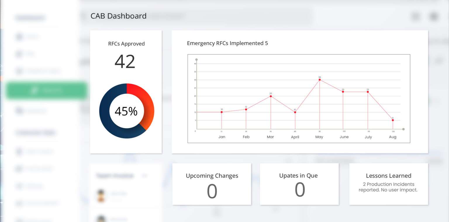
By using visuals instead of simply reporting numbers, any stakeholder that reviews the reports can quickly understand the CAB trends at a glance without reading deep into the report packets or reviewing individual incidents. Stakeholders with less technical knowledge can also find value in the visual nature of the reports.

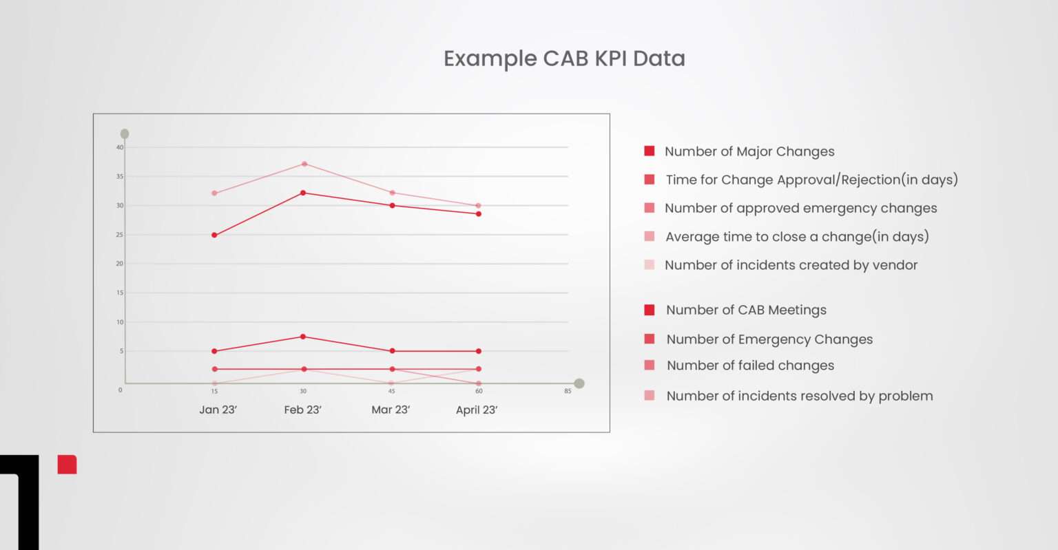
CAB KPIs include the number of major changes, number of CAB meetings, time for change approval/rejection (in days), number of emergency changes, number of approved emergency changes, number of failed changes, the average time to close a change (in days), number of incidents resolved by problem, number of incidents created by vendor.
Benefits of visual data
There are many benefits of using visual data in your CAB reporting process. Presenting CAB data in a visual output can enhance an organization’s decision-making processes in the following ways:
Correlations in relationships
Data visualization allows us to easily identify the relationships between independent CAB variables
Risk & reward
Value and risk metrics can be easily identified without the use of complicated calculations based on the raw data. Areas of concern can be monitored for progress visually.
Frequency
Data visualization allows us to see rates and frequencies of data patterns easily. This can help to predict future frequency and rate trends to CAB-related activities.
Examining the market
using data from several sources to create the CAB visualizations, powerful insight can be gained from visually comparing this data. New data input sources can be added as needed in the future to create a compelling data story.
Trends over time
Using data visuals to identify the trends over time for a variable or variable set is one of the most powerful applications and can inform an organization of where they have been and where data trends are most likely headed in the future.
Reacting to the market
as the CAB visual reports are generated on a monthly basis, information can be quickly interpreted by decision-makers and then acted upon swiftly. Major or growing issues can be identified easily by non-technical stakeholders with a glance.
Implementing visual data techniques
Now that you have a solid foundational understanding of how CAB data accrues and can be a powerful business tool, you might be ready to begin implementing visual data analysis to enhance your organization’s decision-making capabilities:
- Identifying the right visualizations: Organizations should identify the most effective visualizations for their data. Different types of data may require different visualizations to effectively communicate the information.
- Keeping it simple: Visualizations should be kept simple and easy to understand. Too much complexity or clutter can make it difficult for stakeholders to interpret the data.
- Using the right tools: Organizations should use the right tools to create their visualizations. There are many tools available, and the organization should choose one that meets their needs and is easy to use.
- Focusing on insights: The purpose of using visual data techniques is to gain insights into the data. Organizations should focus on the insights they want to gain and use the visualizations to help communicate those insights effectively.
- Customizing for stakeholders: Different stakeholders may have different needs or levels of technical knowledge. Organizations should customize their visualizations to meet the needs of their different stakeholders.
- Providing context: Visualizations should be presented in context to help stakeholders better understand the data. This could include providing explanations of terms or highlighting key trends or patterns in the data.
- Regularly reviewing and updating: Organizations should regularly review and update their visualizations to ensure that they are still meeting their needs and effectively communicating insights. Visualizations may need to be updated as new data becomes available or as the organization’s needs change.
Conclusion
In conclusion, utilizing visual data techniques in Change Advisory Board (CAB) reporting can enhance an organization’s decision-making process by providing stakeholders with a clear and concise representation of the data. This empowers CAB stakeholders with data to make informed decisions about the organization’s service management trends.
By analyzing and presenting data in visual form, correlations, trends, frequency, risk, reward, and other patterns become apparent, enabling decision-makers to identify areas of concern and respond quickly to growing issues. Accrued data over time also provides insights into an organization’s performance and enables data-driven decision-making to improve services and avoid potential downtime events.
Implementing visual data techniques in CAB reporting can be a valuable tool in promoting transparency and accountability while driving business growth.


